My Approach
I focused on building for speed, consistency, and reusability from day one:
Audited all existing UI patterns across product and marketing
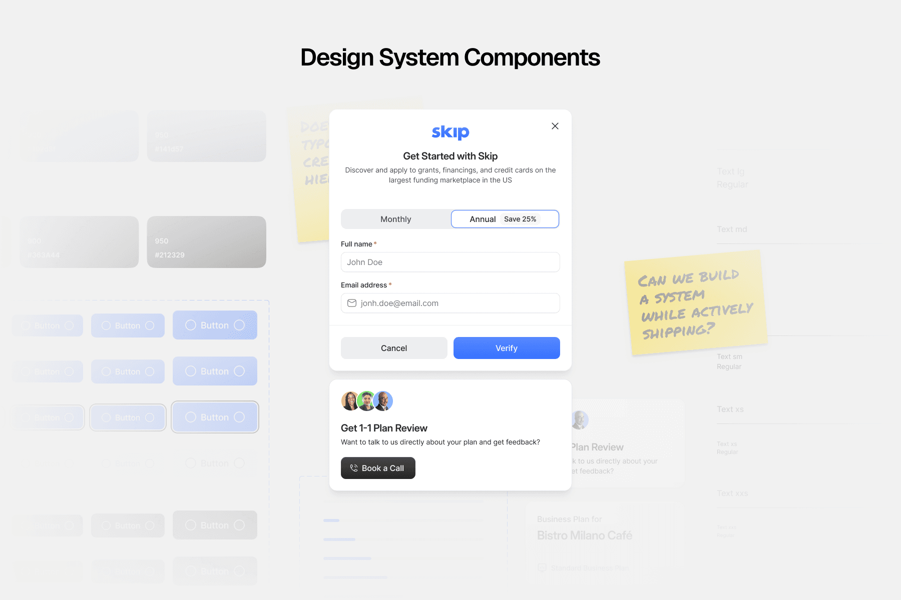
Created a lightweight, scalable design system: typography, color tokens, buttons, inputs, shadows, spacing, and status styles
Built components in Figma using Auto Layout, variants, and flexible constraints
Partnered with engineering to match system styles with coded components
Rolled out the system while redesigning key screens—using real product needs as validation
This wasn't about making a perfect system on day one—it was about building just enough structure to let the team move faster without sacrificing quality.


Key Screens Rebuilt with the System
🏠 Dashboard Home
Reorganized the layout to surface high-value actions and dynamic grant progress.
🏆 Skip Grant Winners
Created a public-facing visual to showcase successful users and build trust.
🙋 My Profile + Settings
Simplified forms and settings using systemized inputs and alerts.
📋 Business Checklist
Rebuilt this foundational tool with improved spacing, visual hierarchy, and reusable checklist components.
🚀 Instant Grants
Designed a new flow for applying to grants in minutes—using dynamic content modules and simplified CTAs.
🔗 Public Checklist
Enabled logged-out users to explore checklist benefits using the same systemized components.
Impact
⚡️ Faster design + handoff cycles using new system
✅ UI consistency across core flows (checklists, profiles, dashboards)
💬 Easier team collaboration with shared language and styles
🚀 Enabled faster shipping across multiple grant features
Even in just two months, the new system became the foundation for ongoing product and marketing growth.

Learnings
You don’t need to overbuild. A simple, well-documented system can make a huge impact—even in a short time.
Start with what's repeated. Buttons, headers, and layouts account for most of the visual friction.
Design systems speed up decisions. Once the system was live, everyone—from PMs to engineers—moved faster.
Visual consistency builds trust. Especially when working with high-stakes flows like funding and grants.


Validation & Next Steps
To validate decisions quickly, I synced regularly with the small founding team to review designs in real product context. I also incorporated real feedback from key customers—especially around grant flows and onboarding friction.
Every screen shipped was a live test: if something created confusion or slowed someone down, we adjusted fast.
If I had stayed longer, I would’ve:
Built a living design system site for faster onboarding
Expanded the system into marketing and mobile
Added tokenized themes for seasonal or partner grants
Introduced more motion and UX affordances across flows